Golden Cross Trading Pattern – What Is It & How Does It Work?
There are numerous methods of trading in financial markets. One of the most popular trading techniques is the technical analysis of chart patterns. This article will explain in detail how to trade the Golden Cross pattern.
How to trade a golden cross pattern in a bull market, and what do moving averages have to do with it? How to read the golden cross signals? This article will answer these and many other questions.
What Is a Golden Cross?
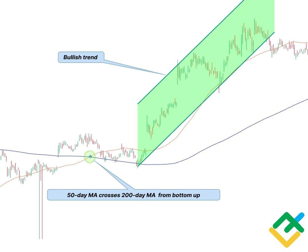
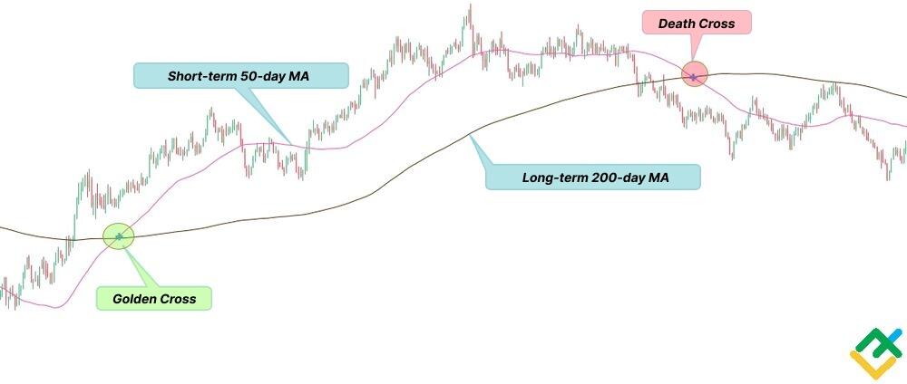
The golden cross pattern is a chart pattern in which the short-term moving average crosses the long-term MA from the bottom up. As a rule, the 50-day MA is used as the short term moving average, and the 200-day MA is taken as the basis for the long term average. However, the periods of moving averages depend on the market conditions and trading strategy.
The golden cross is a bullish signal, indicating that the selling interest is weakening. The golden cross pattern forms in three stages:
- The asset is trading in a bear market, with the 200-day MA above the short-term 50-day MA.
- The trend turns up. The short-term MA breaks through the long-term MA upside.
- It is at the point of intersection of these lines that the upward trend is confirmed. The bullish trend continues when the 50-day MA is above the 200-day MA.
How to Spot a Golden Cross?
Two simple moving average lines, called MA or SMA, are used to detect the golden cross pattern in the hourly chart and in longer timeframes. They show the average price of an asset over a particular period.
It is important not to confuse a simple moving average with the exponential moving average (EMA) since the EMA focuses on the current price trend that has developed, which reacts more sharply to recent prices.
The short term value of the moving average is often 50. The long term value of the moving average is usually 200 in the chart. The period means the number of days, and the MAs are used to average the market noise, that is, price fluctuations that have occurred for these days. Therefore, when the short-term moving average is below the long-term MA, it means that the short-term price swing is bearish compared to the long-term price change.
The pattern takes the form of a golden cross. The point at which the 50-day MA crosses the 200-day MA from the bottom up is a buy signal.
You should look for a golden cross when a bearish trend is ongoing. The pattern can appear in any timeframe, including short term MA crosses. However, the golden cross suggests a more accurate buy signal in longer timeframes from H4 to D1.
The Golden Cross is a lagging indicator, so it is not that efficient in intraday trading. For further confirmation of the pattern in the price chart, traders can also use other technical indicators and candlestick patterns.
Three Stages of a Golden Cross
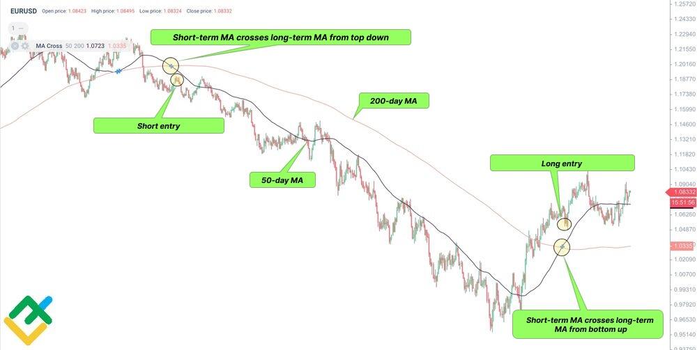
The golden cross pattern forms in three stages:
- The first stage involves the detection of a long-term downward trend in the price chart, in which the short-term moving average is below the long-term one.
- The price trend increases in the second stage of the golden cross. At this moment, the short term MA 50 crosses the long-term MA 200 from the bottom up. An intersection of moving averages means that the short-term trend is about to reverse up. However, you should look for patterns confirming the cross in technical analysis.
- The third stage involves the confirmation of the continuing uptrend.
At the last stage, the short-term moving average should consolidate above the long-term MA. This stage is the key one, as it determines more profitable trade entry points using other technical indicators and candlestick patterns.
Golden Cross Example
The golden cross pattern can be found in any financial market, including Forex, stock market, commodities, and cryptocurrencies. Let us look at the golden cross examples for different assets.
Golden cross in the BTCUSD chart
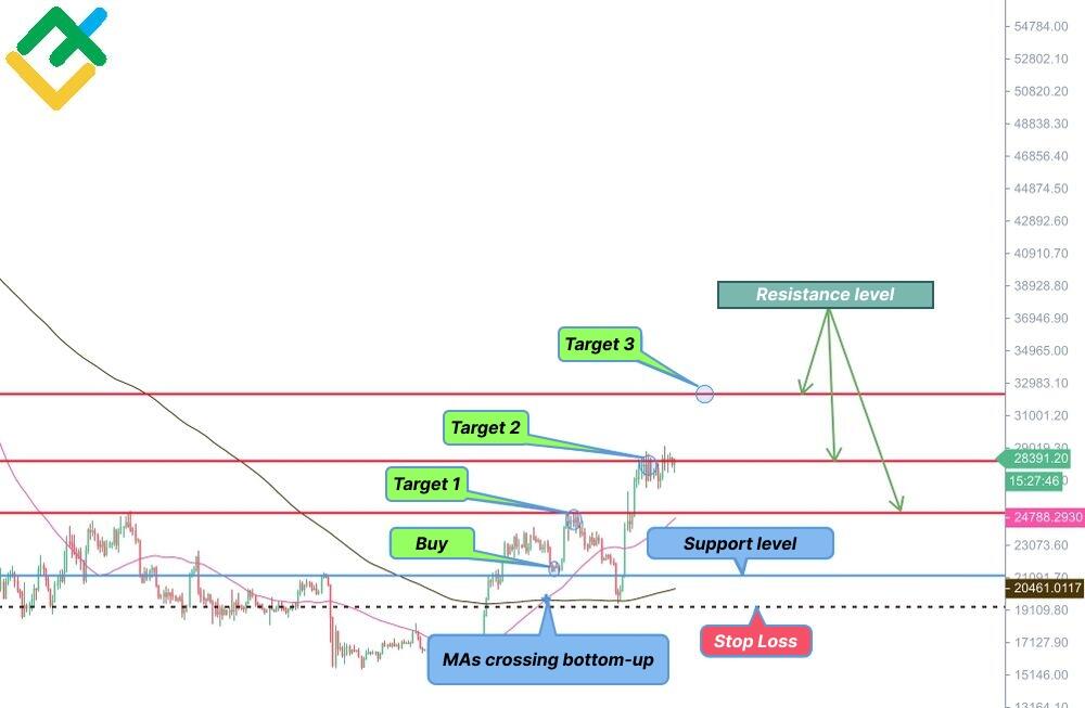
The daily chart shows that the short-term MA breaks through the long-term MA upside, and the price consolidates above.
We can enter a long at the support level after making sure of the bullish price movement. We define the key resistance level to determine the target profits.
Golden cross in the Tesla price chart
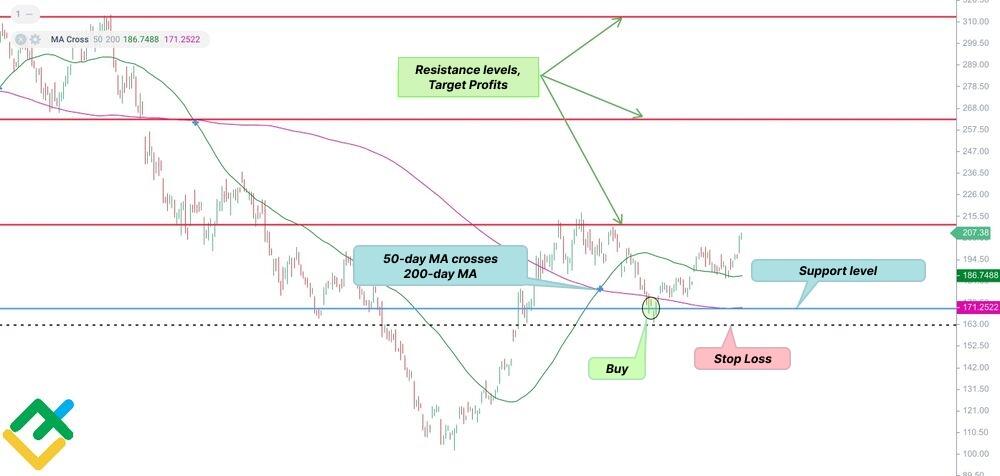
We can see a golden cross pattern in the H4 chart. Next is a short-term correction down, followed by the price reversal up at the support level.
We can enter a long position when the chart pattern is confirmed using other technical tools or candlestick patterns at the support level. A stop loss is set below the support and 200-day MA.
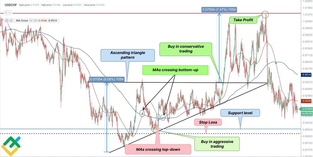
Golden cross in the USDCHF chart
The daily chart short the formation of two golden crosses. The first golden cross emerges within the ascending triangle pattern.
With an aggressive and risky trading strategy, you can open a long position near the support level by setting a stop loss below the support. This will allow the trader to make twice as much profit compared to a more conservative trading strategy.
Conservative trading, in this case, involves opening a long position after the breakout of the triangle upper border, moving the price higher. This is the final sure confirmation of the golden cross pattern. In addition, the chart shows why it is necessary to wait for the pattern to be confirmed.
After the first golden cross forms, a death cross occurs, sending the opposite signal. However, bulls managed to gain control over the market, and the upward trend continues, which is proven by the second golden cross pattern.
How to Trade Golden Cross
Trading the gold cross pattern in financial markets involves some risks, just as any other trading signal. However, golden crosses provide day traders with guidance and understanding of the further price movement in longer timeframes.
Traders usually choose the period of 50 for the short-term moving average and the period of 200 for the long-term MA. They are considered the most effective moving average values. These periods do not always guarantee success in trading, and you can choose other values based on your trading experience.
Candlestick reversal patterns such as a hammer or bullish engulfing and technical indicators can be used to confirm the pattern in the chart. Of those indicators that can confirm a golden cross and a price reversal, the most popular are the Average Direction Indicator (ADX) and the Relative Strength Index (RSI). ADX is used to measure the overall trend strength, while RSI is used to determine if an asset is overbought or oversold. In addition, a golden cross pattern can form inside larger price patterns, such as the double bottom, bull flag, ascending triangle, pennant, and others.
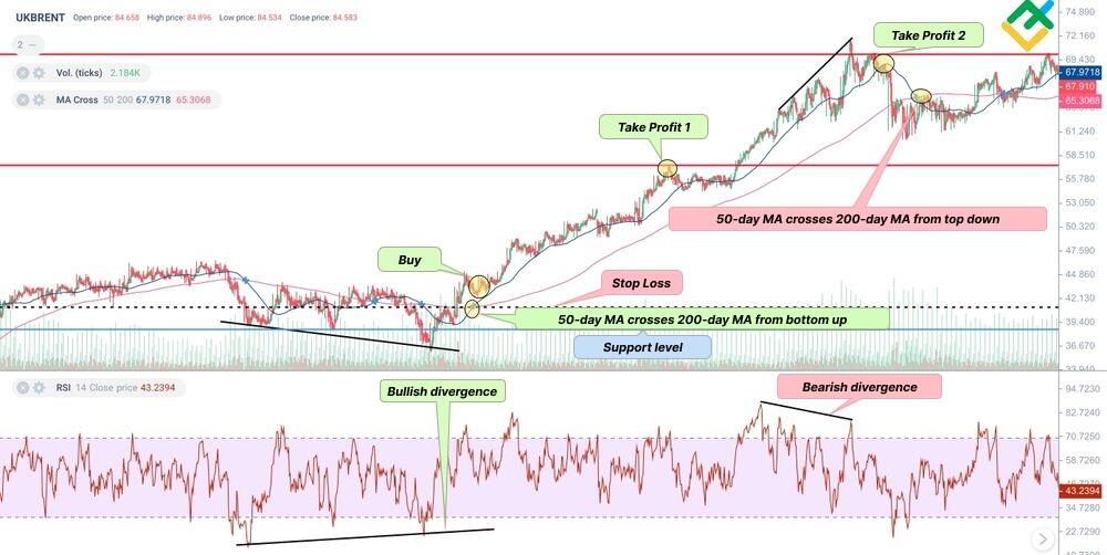
Let’s have a look at how to trade the golden cross in more detail using an H4 UKBRENT price chart.
Before a long uptrend started, the RSI indicator signaled a bullish divergence, which is a strong reversal signal at the low of an uptrend. Besides, the signal that confirmed the reversal of the long term trend up was the 50-day MA that crossed above the 200-day MA, with the price consolidation above. It means that there is a new support level and a good entry point for a long position. When the new support is tested, we can enter a buy trade and set a stop loss below the 200-day MA.
The resistance levels define the profit targets in trading the golden cross pattern. In our case, we can set two target profits. When one of the targets is reached, most of the position is closed, and the rest is moved to breakeven. The exit signal is when the RSI signals a bearish divergence, and the short-term MA crosses below the longer term moving average.
I should stress that the golden cross pattern is a lagging indicator, and the trend could reverse before the fast MA cross above the slow MA.
However, it should also be emphasized that a bottom-up crossover of the 50-day MA and price consolidation above gives a more valuable signal for a trend reversal. This crossover is important as it alerts market participants to bullish momentum after a long bearish trend.
What’s the Difference Between a Golden Cross and a Death Cross?
A death cross is a chart pattern in which a short term moving average crosses below a longer-term moving average, indicating price weakness. The death cross pattern is the opposite of the golden cross. Both patterns are usually accompanied by high trading volume.
Many traders use popular stochastic oscillators such as Moving Average Convergence/Divergence (MACD) or Relative Strength Index (RSI) to confirm chart patterns, including the golden cross vs death cross.
I should stress that the golden and the death crosses are lagging patterns and emerge when the new trend has started. Both the golden cross and death cross can be used to confirm leading reversal patterns.
Golden cross versus death cross: the difference
The golden cross and the death cross are exact opposites. The key differences between the golden cross and the death cross are listed in the table below.
| Golden Cross Pattern | Death Cross Pattern |
| is a bullish signal to buy | is a bearish signal to sell |
| 50-day MA crosses above 200-day MA, which means price strength | 50-day MA crosses below 200-day MA, which signals the price weakness |
| occurs following a long term bear market | occurs following an uptrend |
| in a bull trend, the short-term MA is higher than the long-term MA | in a bull trend, the short-term MA is higher than the long-term MA |
Golden Cross Limitations
The golden cross pattern, like many other chart pattern and technical indicators, may send false signals. It is better to use the golden cross pattern in long-term timeframes to confirm early reversal signals. The golden cross gives a delayed signal to buy, as it usually forms after the trend has turned up.
Therefore, the golden cross is an additional confirming pattern for earlier reversal patterns. They can be found in candlestick analysis or with the help of technical indicators, which are compiled using certain algorithms and statistical data. In addition, the golden cross pattern goes well with fundamental analysis when trading stocks or Forex.
Another limitation of trading the golden cross is that the pattern could be used in the timeframes from H4 and longer. Due to a lot of market noise, it can provide limited predictive value in shorter timeframes. This can give a false sense of the trend direction to traders. The longer the analyzed chart, the stronger and more accurate the signal to buy.
In addition, an important and integral part of trading is the risk and money management rules. Always watch the risk/reward ratio and do not risk more than you can afford.
Pros and Cons of Using Golden Cross Pattern
Like many other indicators and patterns in technical analysis, using the golden cross pattern has a number of advantages and disadvantages.
Let us look at the golden cross pros and cons in trading.
Advantages
- Golden cross is easy to detect and analyze in the price chart;
- It helps to define potential entry points;
- It can serve as a trend reversal signal in longer timeframes;
- It can be used on its own or in combination with other technical patterns;
- The pattern can be used in trading any financial markets;
- It can be used in any timeframe, but works better in H4 and longer timeframes.
Disadvantages
- A golden cross sends many false signals in shorter timeframes due to the market noise;
- It sends a late signal to buy, as it is based on moving averages;
- It is better to use other technical indicators and chart patterns to confirm the gold cross signal to buy;
- It predicts the trend reversal more accurately when it is accompanied by high trading volumes;
- The pattern gives a buy signal only after the trend has turned up.
Conclusion
Summing up, a golden cross pattern is a bullish reversal pattern based on moving averages.
A golden cross occurs when a short-term moving average, usually the 50-day, crosses above its long term moving average, usually the 200-day. It signals a bearish-to-bullish trend reversal and shows a buy entry point.
Although the Golden Cross is a strong signal, it should be used in conjunction with other technical indicators and patterns to confirm its validity and accuracy.


