10 Day Trading Patterns for Beginners
There are many different day candlestick trading patterns used in intraday trading on Forex.
In this article, we will analyze popular patterns for stock markets, which can also be applied to various complex instruments, for example, currency and cryptocurrency pairs. Day traders often use them when trading with leverage on the derivatives market. With knowledge about these tools, you will be able to identify market entry points and benefit from various situations that develop in price candlestick charts.
What is day trading?
Day trading means trading financial markets within the trading day. With day trading, open positions are not carried overnight, but rather closed within one trading day.
The analyzed time period depends primarily on the day trade strategy. Successful day traders do not recommend using timeframes less than 15 minutes.
There are two types of day trading:
- Scalping uses timeframes from 1 to 30 minutes.
- News trading is intraday trading, in which day traders, including swing traders, take into account news factors in addition to fundamental analysis and technical analysis. Professional traders know how world events affect the market and take them into account. The timeframes suitable for this type of day trading are 15 minutes, 30 minutes and one hour.
Why Are Chart Patterns Important
Chart patterns are important in trading because they are closely intertwined with the psychology of price action. Price chart analysis first appeared in the 17th century.
It is more convenient to analyze asset’s price patterns in a candlestick type of chart, since Japanese candlesticks provide more information: price opening and closing, price movement high and low. It is important not to confuse price pattern analysis with candlestick chart pattern analysis, which is based on assessing the appearance of one bearish or bullish candle.
As a rule, candlestick patterns are cyclical and repeat the movement, forming price patterns in the form of figures. Based on these candlestick patterns, a professional trader and a beginner can predict further price movement and open profitable trades, setting clear goals for this movement.
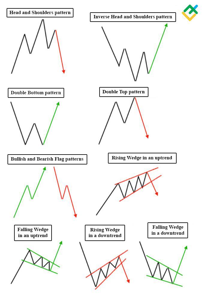
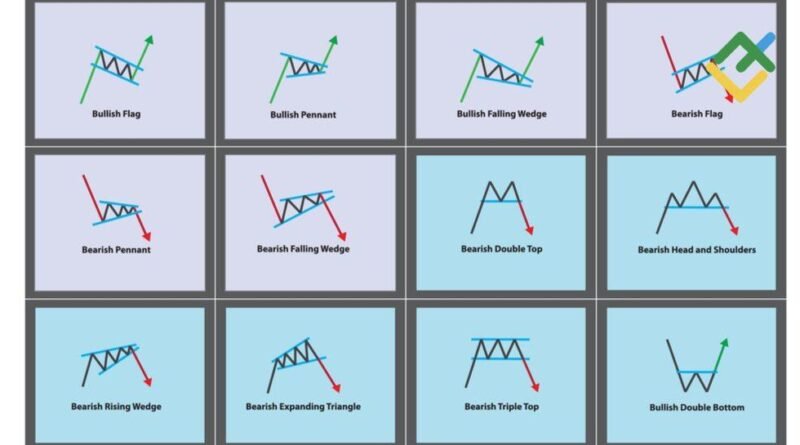
Examples of price candlestick charts are such stock chart patterns as double bottom, double top, head and shoulders chart patterns, inverted head and shoulders, rising wedges and falling wedges, flag, ascending triangle, descending triangle, and others.
Chart patterns are an essential tool for traders to analyze market movements and make informed decisions. These patterns provide insights into the psychology of market participants and help traders identify potential trends and reversals.
How Forex Chart Patterns Work
Forex graphic chart patterns are models that day traders use to determine the direction of price dynamics based on its movement in the past. The main purpose of graphic chart patterns is to provide the trader with information for opening a short or long position. Based on statistical and graphical data, the trader aims to do profitable trades.
How to Read Chart Patterns
Graphic chart patterns are easy to identify with the help of Japanese candlesticks, bar and line figures. There are two types of candlestick patterns in graphical analysis:
1. Reversal bearish and bullish patterns:
- head and shoulders, inverted head and shoulders;
- double top and double bottom;
- rising wedge in an overall uptrend and others.
2. Trend continuation patterns:
- rising wedge in a downward trend;
- falling wedge in an uptrend;
- bullish and bearish trend rectangle”;
- bearish and bullish pennant;
- symmetrical, ascending triangles, descending triangles and others.
10 Common Day Trading Patterns
In this section, we will analyze the top 10 day trading candlestick patterns that appear most often in the chart when trading intraday.
Cup and Handle
This chart pattern occurs on various timeframes and is suitable for intraday trading. The pattern can be found in almost all financial complex instruments.
The cup and handle chart pattern is a continuation of an primary trend in the upward direction, however, it can also be a bearish trend reversal chat pattern.
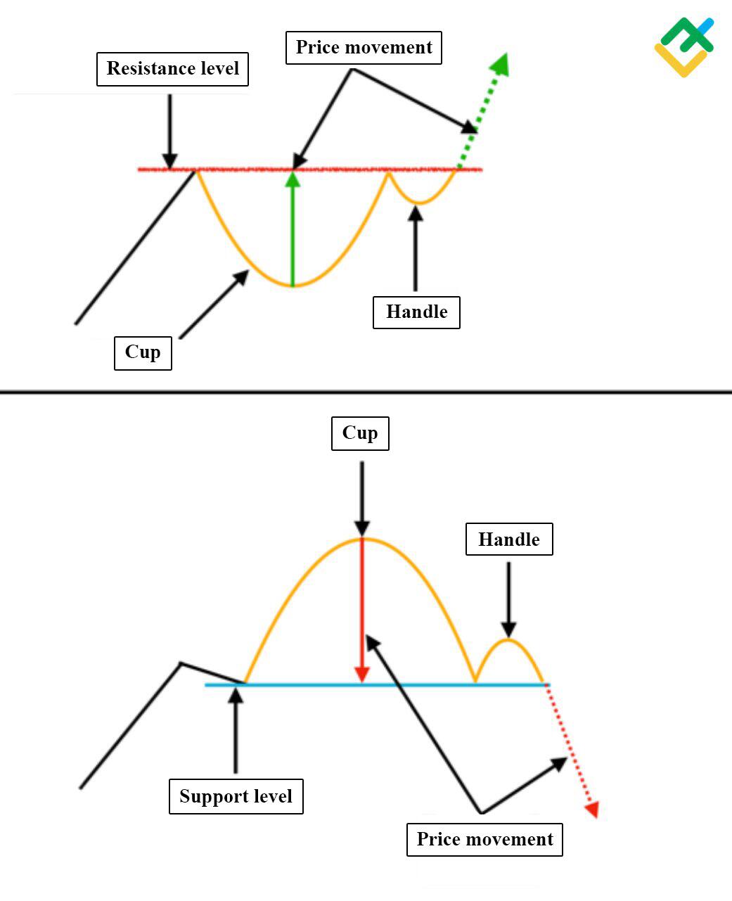
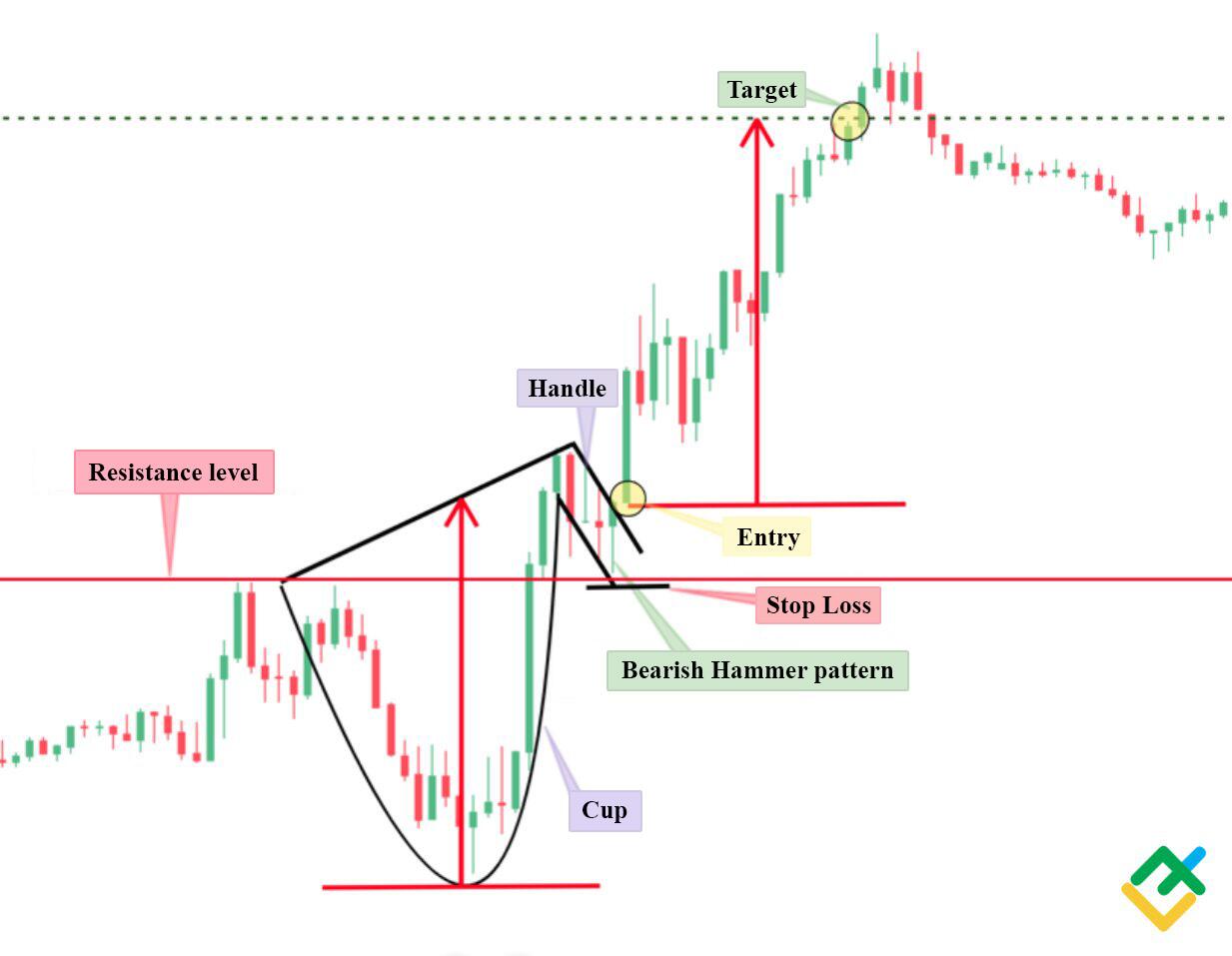
In this fifteen-minute EURUSD chart you can see an example how to recognize patterns of cup and handle. In the current situation, it was possible to open a trade after the chart pattern was completely formed and the broken resistance level was retested. The picture shows that the resistance became a support level, and a bullish hammer candlestick pattern has formed above it. Exiting the handle was a long position signal. The price movement is calculated from the bottom of the cup to the resistance or higher. The stop loss should be placed below the newly formed support line.
Triangles
The appearance of triangle patterns in the chart makes it difficult to predict the price movement, since there are three types of this chart pattern.
Symmetrical Triangle
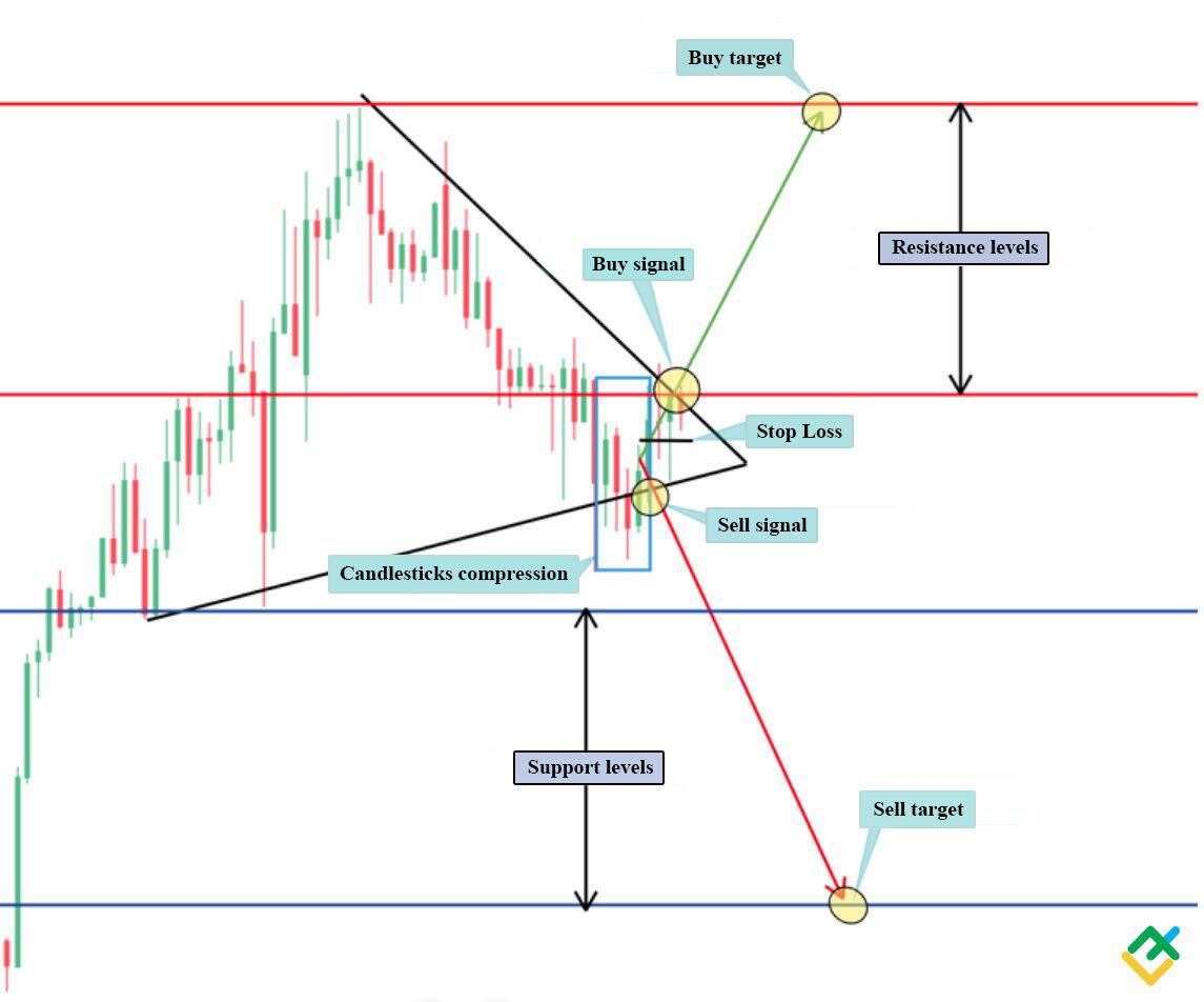
The formation of this type of continuation patterns looks like the narrowing of price swing highs and swing lows. In the current case, it is difficult to predict the movement of the quotes. There is a considerably high risk of bearish and bullish traps which can lead to losing money rapidly, which is why it is important to wait for the triangle to be confirmed up or down and the price to consolidate higher. It is advisable to wait until the price tests the broken level.
Price movement implies a symmetrical increase or decrease in quotes.
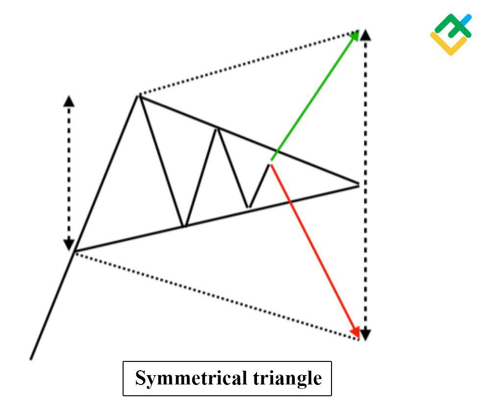
In the 30-minute UKBRENT price chart, there is a formation of a symmetrical triangle. You can see that there were attempts to trap both bears and bulls. In the current situation, before making a decision, wait for the breakdown of the triangle up or down. Stop loss should be placed in the middle of the narrowing channel. For a more accurate picture, japanese candlestick patterns’ analysis should be used.
The bears made an attempt to break through the lower border of the triangle, however, the bulls repelled the attack, thus forming a bearish trap of candle squeeze.
In this case, you need to wait for the final consolidation of the price, and then open a trade.
Ascending Triangle
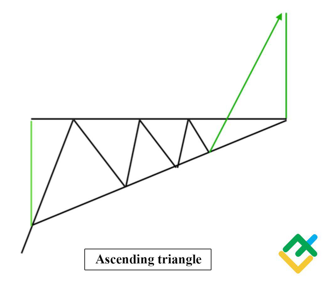
The ascending triangle continuation pattern has a clear horizontal resistance line. Upon reaching it the quotes reverse, forming rising lows. After consolidation, the asset price breaks through this resistance level, and the price continues to rise by the height of the ascending triangle.
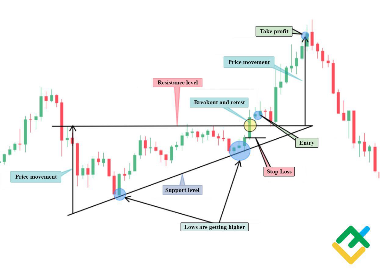
This 30-minute BTCUSD chart is an example of the formation of an ascending triangle.
The picture below shows the formation of a resistance level and rising lows, after which there was an impulse breakout of quotes and price consolidation above the resistance. After retesting the level, there was an opportunity to open a buy position with the target at the height of the formed triangle. Stop loss in this case is placed below the broken resistance line at the distance of the low of the impulse candle.
Descending Triangle
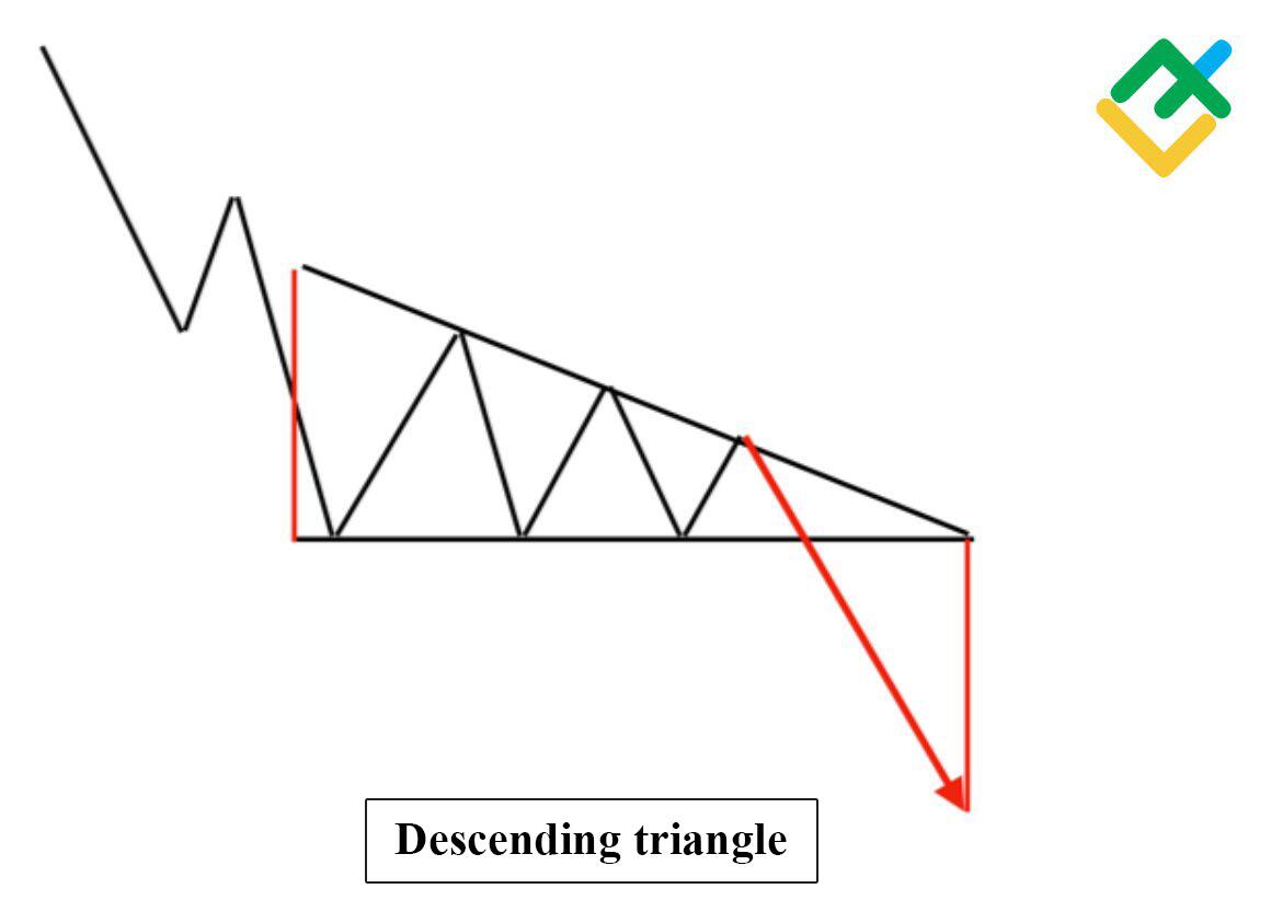
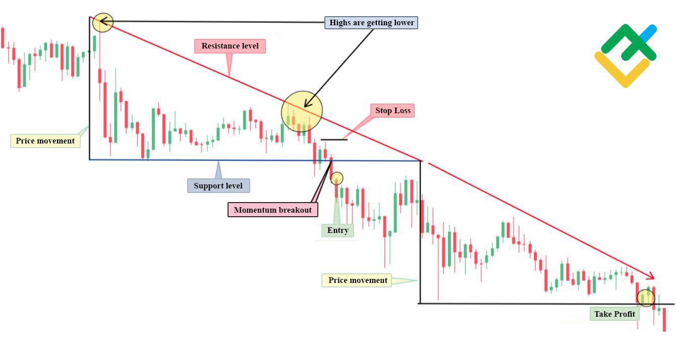
The descending triangle continuation pattern is the opposite of the ascending triangle. In this figure, there is a clear support level and a smooth decrease in highs. As a result, the lower price trend line is broken, and the price continues to rapidly decline by the height of the triangle.
Below, you can see the descending triangle in the 15-minute chart of the XAUUSD. Here, the formation of the candlestick pattern is clearly visible. Quotes were prevented from moving below the support level several times. At the same time, there is a decrease in the highs of the instrument. After the consolidation of the particular asset, the support level was broken, and the price went down. A short sale can be made only after the price consolidates below the support line. Take profit should be placed by measuring the height of the triangle, as in other types of this candlestick pattern. Stop loss in this case is placed above the support level.
Flag
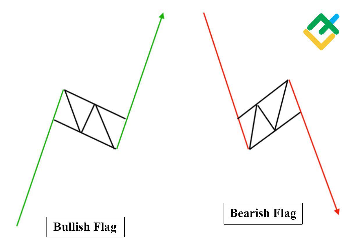
The flag is a trend continuation pattern. There are two types: bullish and bearish flag.
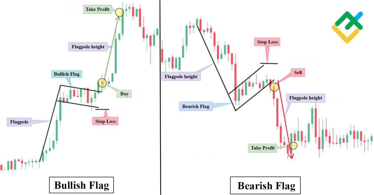
The price constructs a flagpole, then comes the flag and impulse breakdown of quotes when the price leaves the “flag by the height of the flagpole.
This candlestick pattern is suitable for intraday trading on 5, 15 or 30-minute timeframes and is one of the best figures for day trading.
The 30 minute USDJPY chart below shows a clear formation of bullish and bearish flags. After active growth in the bullish flag and decline in the bearish flag, quotes are consolidated in a descending or ascending rectangle, which forms the pattern. Buy or sell only after the price has exited the pattern. The stop loss order should be placed just below or above the flag itself, depending on whether it is bullish or bearish. The target for this pattern is equal to the height of the flagpole.
Falling Wedge
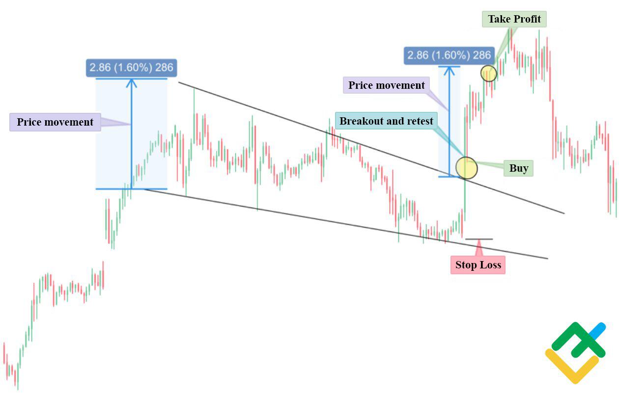
The falling wedge is one of the continuation patterns that resembles the triangle chart pattern, so novice day traders often make mistakes when opening trades. The main difference between a falling wedge and ascending triangles or descending triangles is the downward trend of support and resistance lines, while a triangle has a clear horizontal line of support or resistance. As part of risk management, price movement must be defined as the height of the wedge itself. However, with a massive increase in trading volumes, quotes may go even higher.
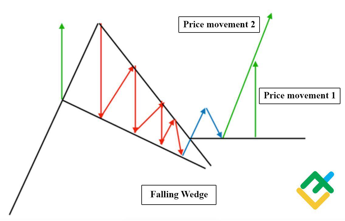
You can see an example of the falling wedge stock chart patterns below in the 15-minute Apple Inc chart.
The picture shows that the price was gradually decreasing after the prevailing trend in bullish direction, while the lows and highs of the price were declining. After the narrowing of the trading channel, there was an impulse breakdown of quotes upwards. After waiting for the re-testing of the broken resistance line, we could open a buy trade with the target higher by the level of the falling wedge height. Stop loss in this case should be set at the lower border of the trading channel.
Rounding Bottom
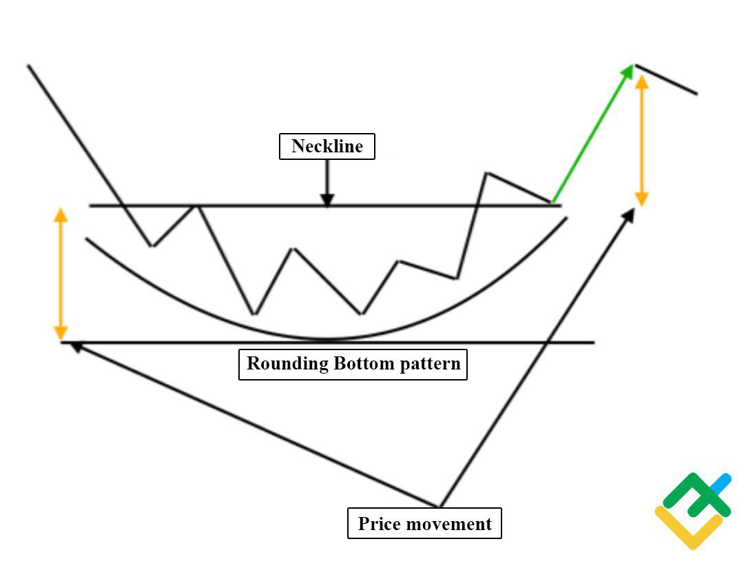
This pattern is similar to the cup and handle pattern. The difference is the absence of a handle.
The formation of this pattern occurs in a downtrend, when the forces of the bears run out, and the price has reached a local bottom in the chart and the bulls have become more active. After the consolidation of the asset in the side channel, the quotes break through the neckline level upwards and move in a corrective upward dynamics to the height of the formed pattern.
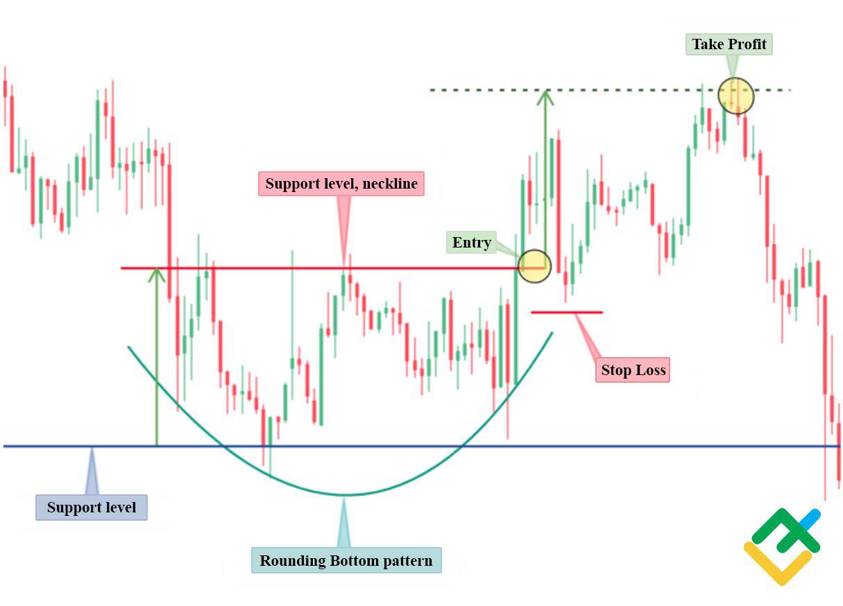
The formation of a rounded bottom pattern is demonstrated below in the 30 minute XAGUSD chart. After the quotes moved down, the asset found a local bottom, followed by the consolidation of the instrument. Then there is an impulse breakout of the price upwards and the closing of the bullish candle above the neckline level.
We could open a buy trade with the opening of the second candle.
The target of the movement is indicated as the height from the support level to the resistance level. Stop loss in this case should be set below the neckline level.
Double Top
The double top pattern is often seen in lower and higher time frame candlestick charts.
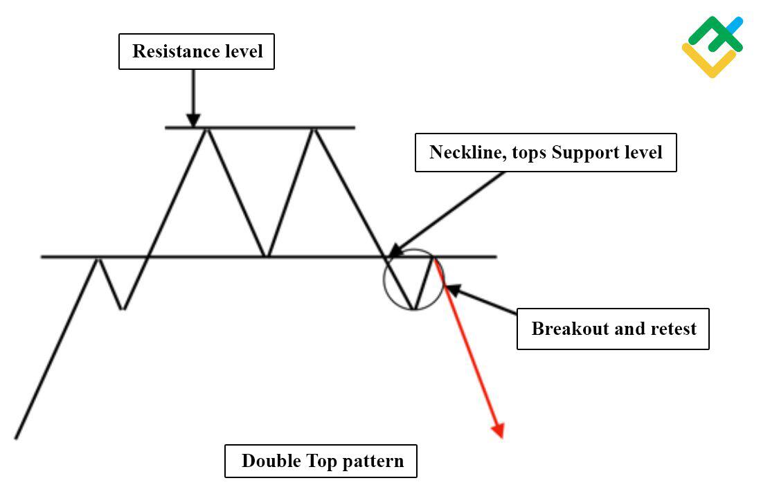
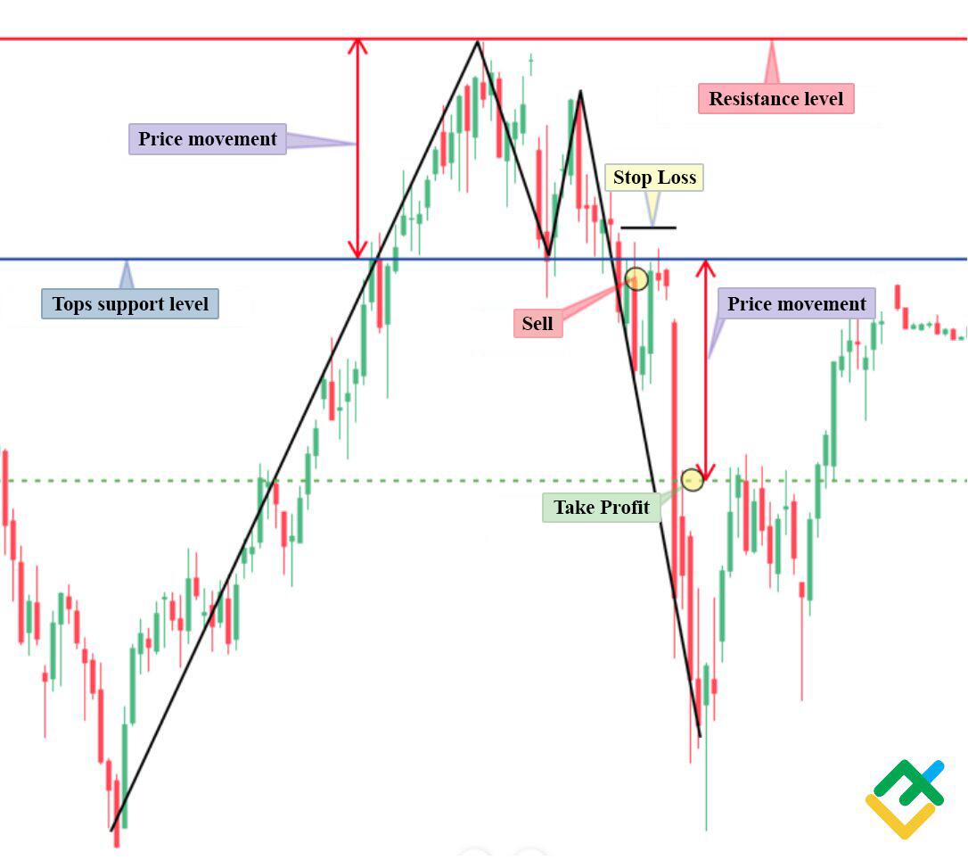
The asset is forming a double top while trading in a channel between the resistance and support levels. After an unsuccessful attempt to break through the resistance line for the second time, the quotes turn back and overcome the neckline – the top support level. After a successful breakthrough down and retesting of the newly formed resistance, the price moves further, completing the formation of the pattern.
You can see a great example of this pattern in the 30-minute USCRUDE chart below.
The picture shows the formation of two peaks and an impulse breakout of their support level. Further, there is a consolidation of the instrument below and re-testing of the new resistance. The entry point is below the support level. Next, a conservative target is calculated according to money management rules.
The target size is equal to the height from the top support level to the resistance. Stop loss in this case should be set above the support level to help traders avoid losing money rapidly.
The double top pattern can be seen in various time frames and is a valuable tool in a trader’s toolbox for identifying potential market reversals.
Double Bottom
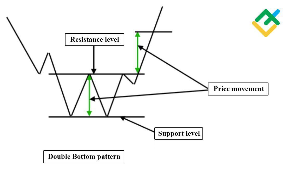
The double bottom pattern is the opposite of the double top pattern signaling the beginning of a new trend. As a rule, it occurs in the local base of the asset and tests the support level twice. The development of this pattern involves a breakdown of the resistance level, after which the quotes test the broken resistance. After that, the price bounces higher to the level of the side channel height, which formed between the support and resistance lines.
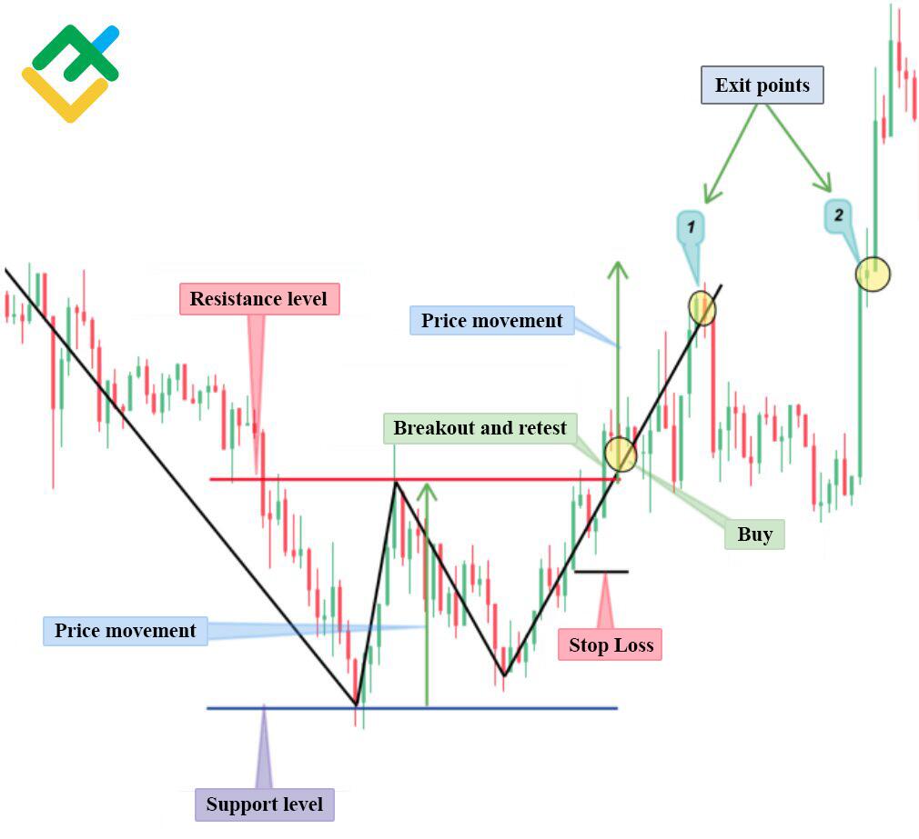
You can see an example of this pattern in the 30 minute ETHUSD chart.
The picture below shows the formation of the pattern. After the formation of the second bottom, the asset rushed towards the resistance, which it overcame and tested again, consolidating higher.
We could make a buy trade after the instrument consolidated above the resistance. The price movements are equal to the height of the side channel between the support and resistance lines.
The trade could be closed at two points. Stop loss in this case should be placed lower, in accordance with the risk management rules.
Bullish Hammer
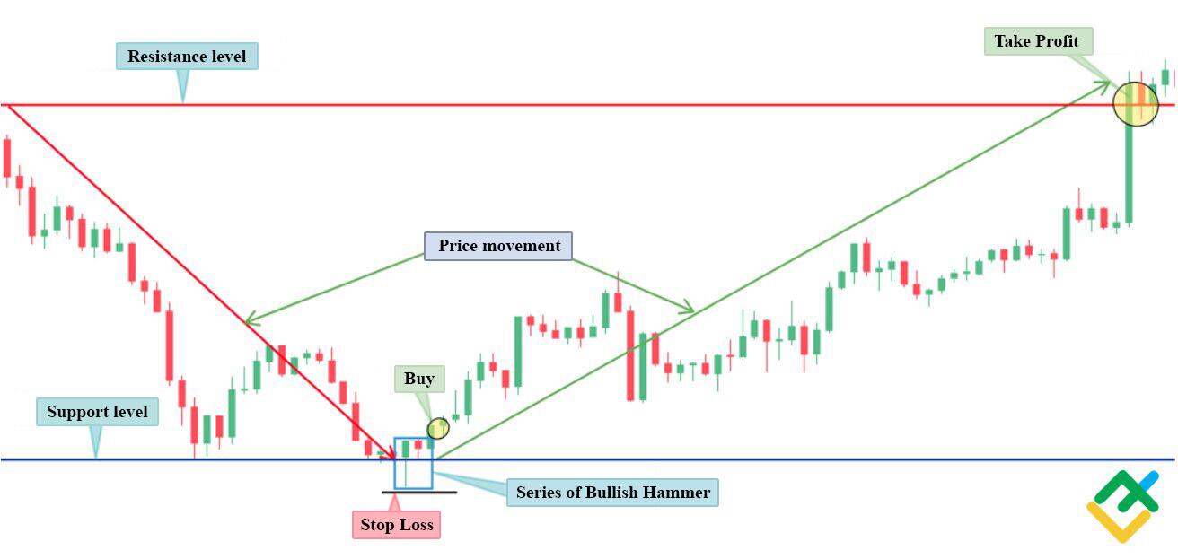
The hammer pattern belongs to japanese candlesticks analysis and is characterized as a bullish reversal pattern signal. Hammer candlestick is one of the best patterns for intraday trading. This bullish reversal pattern forms at a local bottom and signals buyer dominance in the market. When trading this pattern, a trader needs to focus on the market situation as a whole.
If before the appearance of the hammer the downward movement was strong, there’s a high probability that after the pattern, the bullish reversal and further movement will be just as strong. In addition, when trading this pattern, you need to start from support and resistance levels in order to determine the price dynamics more accurately.
The color of the hammer is not important, but the very structure of the bar is. However, a green candle (bullish candle) indicates stronger buying power. The name of this pattern comes from its shape – a small body and a long wick down that looks like a hammer.
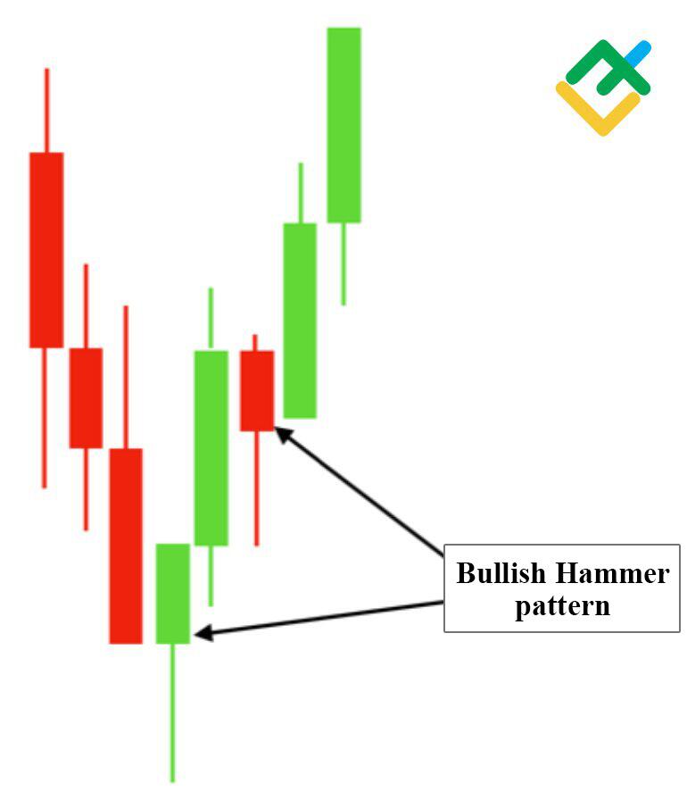
In the 15-minute CADJPY chart, we see a signal within the day.
The appearance of a hammer reversal pattern means that at this mark there is a support level for the asset, below which bears cannot go. The resistance is where the decline started. The downward movement was strong, therefore, the recovery implied a strong upward movement.
In the picture below, a series of bullish patterns of hammers formed, after which the quotes reversed. A buy trade could’ve been made after the formation of the second hammer. Stop loss should be placed just below the low of the pattern.
Head and Shoulders
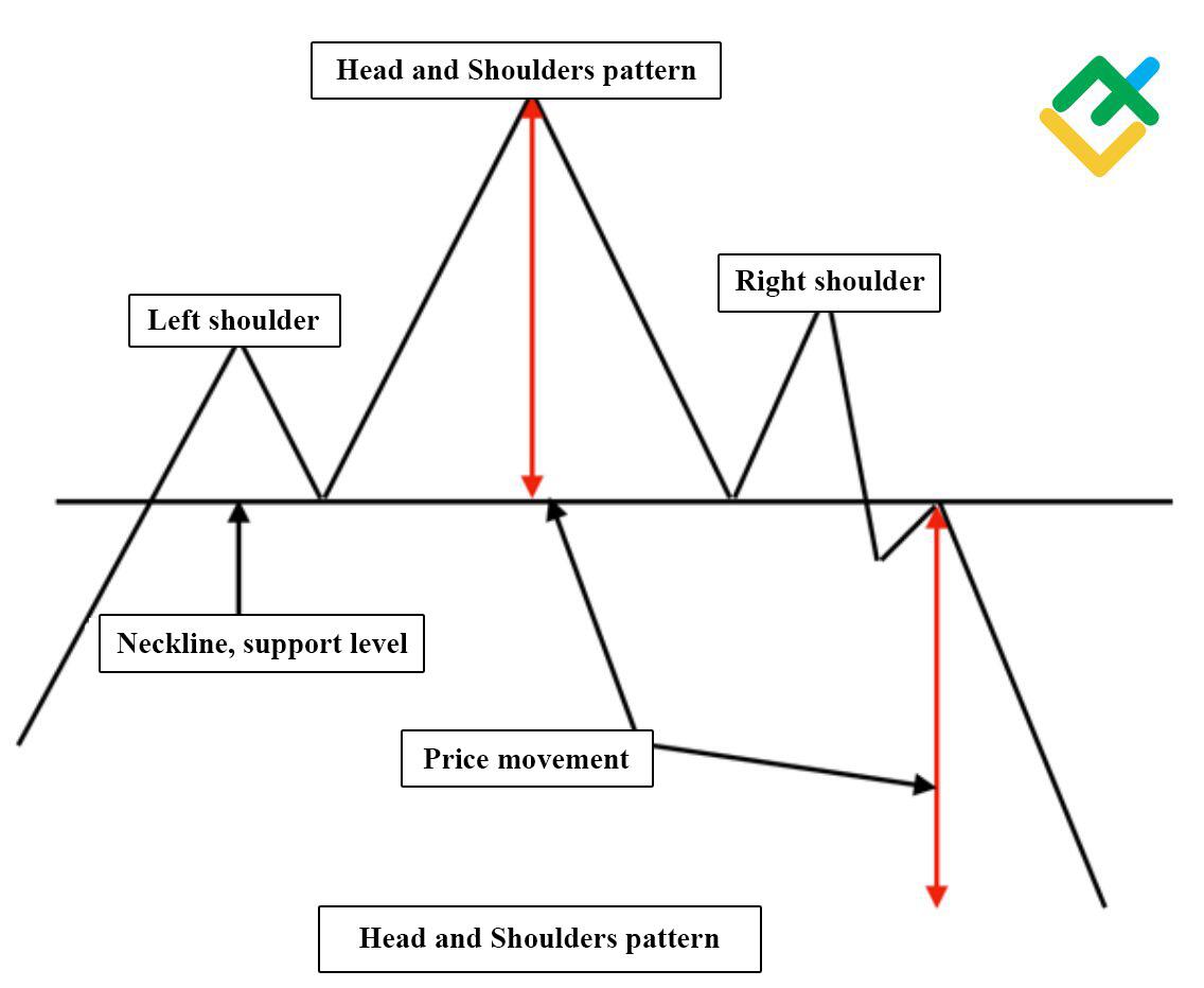
The head and shoulders reversal pattern appears in the charts less frequently than other chart patterns. It forms three vertices, one of which is located in the middle above the other two. At the base of these peaks is the neckline – the support level. Sell trades should be opened only after the formation of the right shoulder, the breakout of the neckline level by quotes from the top down and the consolidation of the price lower. In addition, the right shoulder should be slightly higher than the left one, but not always.
In the event of a breakout, a short-term upward correction is possible to test the newly emerged resistance.
The price movements are calculated as the distance from the neckline level to the head.
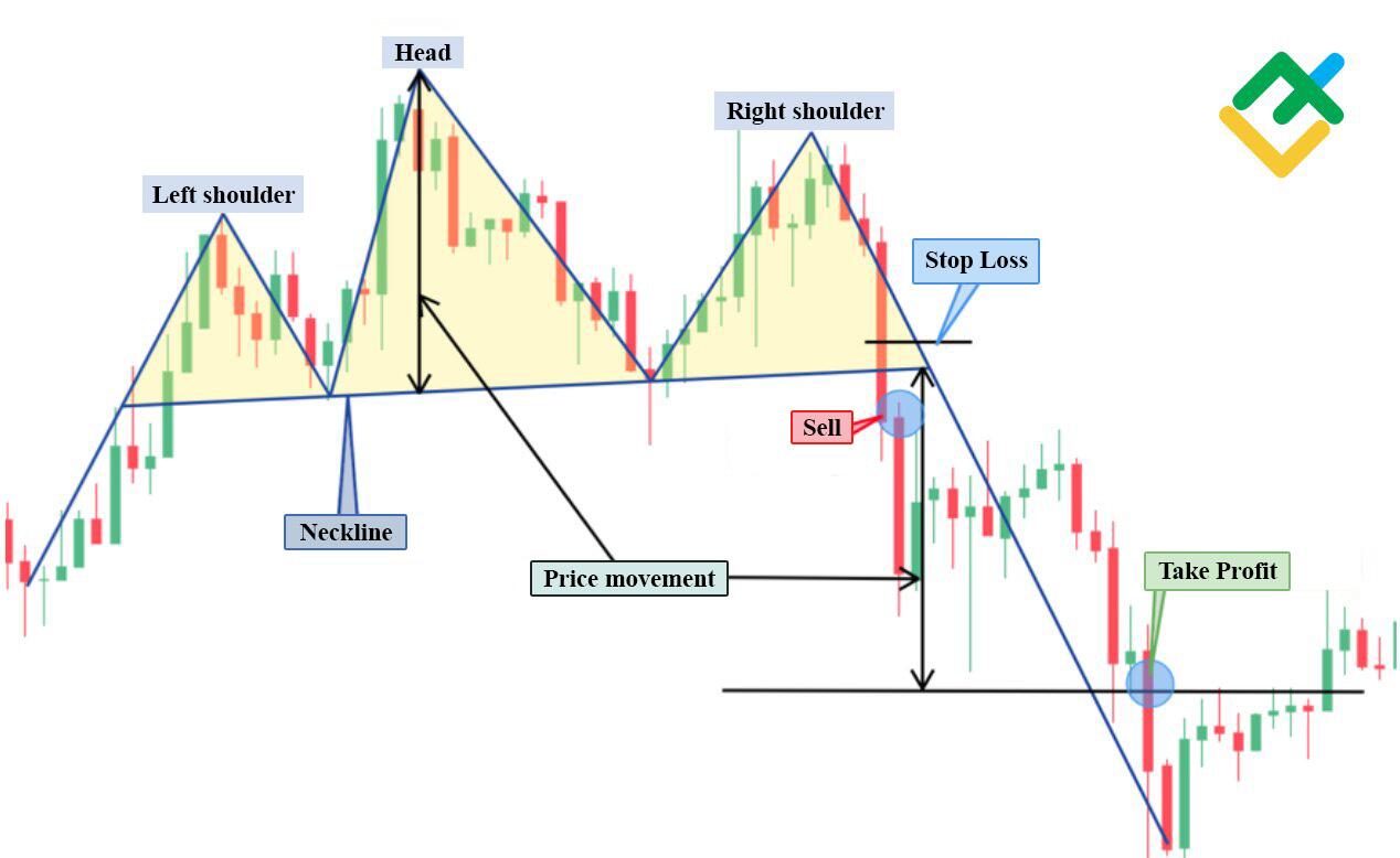
In the 15-minute BTCUSD chart below, there is a fully formed classic head and shoulders pattern.
We could sell the instrument after the price fell below the neckline and the quotes consolidated below this level. Take-profit could be set by measuring the distance from the level of the neck to the level of the head. Stop loss in this case should be placed just above the broken support level.
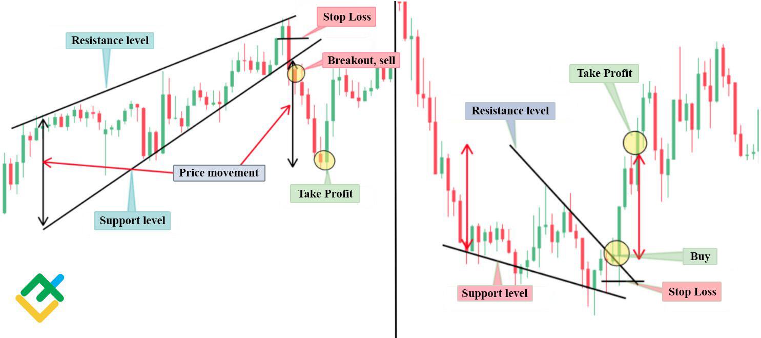
Wedge
The wedge has several varieties. This pattern can form in both uptrends and downtrends.
Rising wedge in uptrends and downtrends signals an imminent trend reversal of the quotes down. The falling wedge in both cases indicates an imminent breakout of the upper trendline. When opening trades based on this pattern, you need to focus on the formation height.
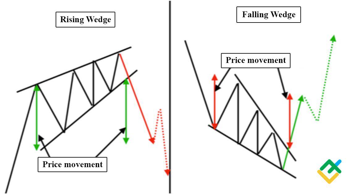
You can see an example of the formation of this pattern in the 30-minute GBPAUD chart. The picture below shows that when the trading channel narrowed and the wedge pattern formed, there was an impulse breakdown of the price to the level of the formation height of this pattern.
Only enter after a confident consolidation of the price and an increase in trading volumes. Stop loss in this case should be set above or below the broken level, depending on the type of formation.
Pennant
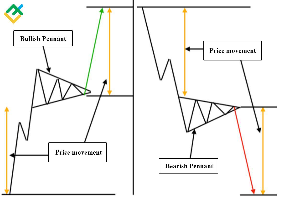
The pennant pattern is similar to the flag pattern. The difference between the pennant and the flag is that the former forms a symmetrical triangle. In the case of the flag, the price range of movement is calculated as the length of the entire flagpole. In the case of the pennant, the price movement is equal to the length from the bottom to the beginning of the formation of the symmetrical triangle.
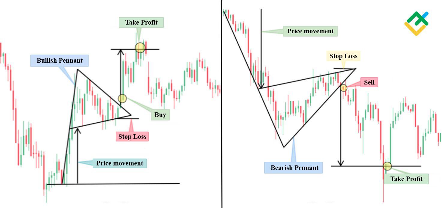
In the 15 minute XRPUSD chart below, you can see an illustration of a bullish and bearish pennant.
In both cases, the price range of the movement is equal to the height from the support or resistance level to the beginning of the formation of a triangle pattern.
The entry points in both cases are at the exit of the price from the triangle. Stop loss should be placed above or below the formed pattern, depending on the movement.
Pattern-based trading strategies for short-term and intraday trading
For day trading strategies, you can use all of the above chart patterns. Recommended time periods for market analysis are 5, 15 and 30 minute timeframes. In a short-term investment strategy for 1-2 days, you can use the hourly chart.
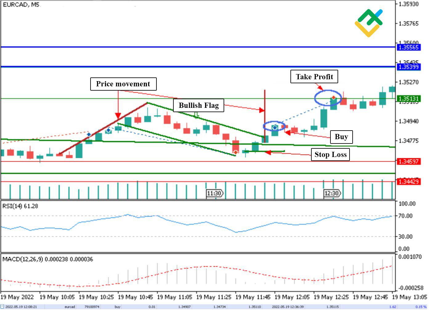
Below is a 5-minute EURUSD chart showing a bull flag formation. After determining the price movement based on the flagpole and waiting for the price to exit the pattern, I opened a minimum buy trade of 0.01 lots with a specific target for the instrument. I set a stop loss inside the flag at the point where the growth started. Half an hour later, my trade closed with a profit of $1.62.
After analyzing the 15-minute GBPUSD chart, I identified the formation of the falling wedge, from which a breakout of quotes was expected.
After the price broke through and tested the level, I opened a buy trade of 0.01 lots.
As part of the trading strategy, the target for the instrument was at the distance from the beginning of the downtrend to the beginning of the first upward correction. The stop loss was set as part of the risk management just below the broken level.
Some time later, the trade closed intraday with a profit of 6.52 dollars.

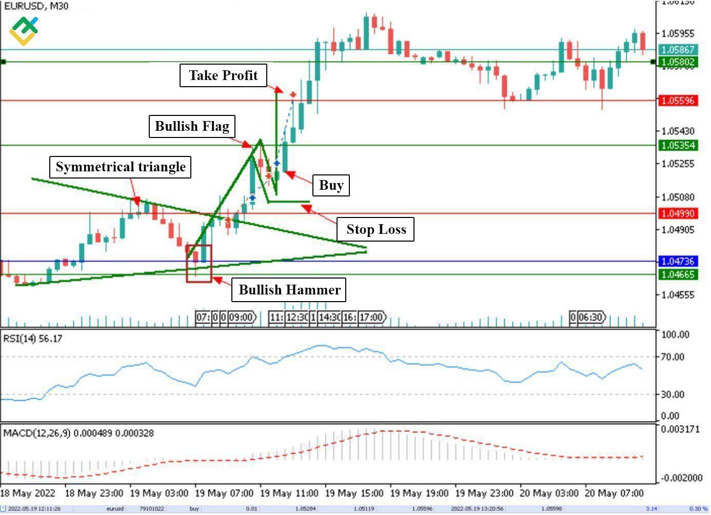
In parallel with two other trades, there was also a buy situation in the 30-minute EURUSD chart. A symmetrical triangle has formed in the instrument. Let me remind you that within the framework of the trading strategy for the symmetrical triangle, the price can go both up and down. Therefore, you must first wait for a confirmation of the breakdown.
In addition, a bullish hammer formed at the base of the triangle before the start of growth, which was additional confirmation of the strength of buyers. The impulse breakout of the triangle formed another confirming pattern – the bullish flag. After waiting for the exit from the flag, I opened a buy trade of 0.01 lots, setting a target equal to the height of the flagpole. The stop loss was placed below the formed flag.
The target was reached 1.5 hours after the trade was opened, and the profit was $3.14.
Best tips for beginner to use patterns in day trading
Day trading is a fairly high risk type of income which can lead to losing money rapidly, so before you commence trading, try to follow the following tips:
Determine the Market Mood on Different Timeframes
Before you begin day trading, it is important to conduct investment research and identify the mood of the market by analyzing various timeframes ranging from 5-minute charts to daily charts. This will help you understand the overall trend and make better trading decisions.
Use Technical Indicators in Conjunction with Price Action Analysis
It is recommended to use classic technical analysis indicators such as RSI, Stoch, or MACD in the chart in conjunction with price action analysis. This will help you identify patterns and potential trading opportunities.
Wait for Patterns to Fully Form and Identify Profitable Entry Points
After identifying chart patterns, it is important to wait for it to fully form before entering a trade. This will increase the probability of a successful trade. Additionally, identifying profitable entry points is crucial for maximizing potential profits.
Implement Risk Management Strategies
To preserve your capital, it is important to set stop losses and stick to your own risk management strategies developed in compliance with your risk tolerance level. This will help minimize losses and protect your retail investor accounts. Moreover, one can start with using a demo account which is often provided by trading platforms and brokers.
Stay Up-to-date with News Background
When trading intraday, it is important to monitor price movements and stay up-to-date with news background. This will help you identify potential high risks and trading opportunities that may affect the direction of the price.
Beware of Bull and Bear Traps
Bull and bear traps are common chart patterns in day trading and can lead to significant losses if not identified and avoided. These traps occur when the market appears to be moving in one direction, but suddenly reverses and goes in the opposite direction. This can happen on lower timeframes, where price movements can be more erratic.
Keep Calm and Avoid Impulsive Decisions
Finally, it is important to stay calm and avoid impulsive trading decisions. Emotions can cloud judgment and lead to losing trades. By staying calm and following a well-defined trading plan, you can increase your chances of success in day trading.
Conclusion
This article provides a detailed analysis of intraday trading. It discussed the key points that every trader needs to pay attention to. We have established that it is best to analyze day trading patterns on lower timeframes up to one hour. In addition, the article reviews in detail the technical analysis patterns that can be used for successful trading by closing trades during the day.
In addition, the article discussed trading strategies for some patterns, which were tried in practice.
Price pattern analysis is applicable to various complex instruments, including currencies, cryptocurrencies, and securities.


Pingback: The 34 EMA With Trendline Breakout Forex Trading Strategy - EasyPips
Pingback: Bollinger Band Forex Trading Strategy Using Dynamic Support And Resistance - EasyPips
Pingback: Advanced Ways To Enter A Trade - EasyPips
Pingback: Anticipating Forex Reversals: Strategies & Signals - EasyPips
Pingback: Moving Average Crossover: Proven Strategies for Forex Success - EasyPips
Pingback: Master the Market: 30 Minute Forex Trading Strategy Explained - EasyPips
Pingback: The 4-Hour MACD Strategy Uncovered! - EasyPips
Pingback: Twin Peak Trading Strategy: Mastering Bearish Reversals - EasyPips
Pingback: Maximize Forex Profits: Master Daily Chart Swing Trading with Expert Techniques - EasyPips
Pingback: Forex Success Unlocked: Mastering Technical Analysis and Risk Management - EasyPips